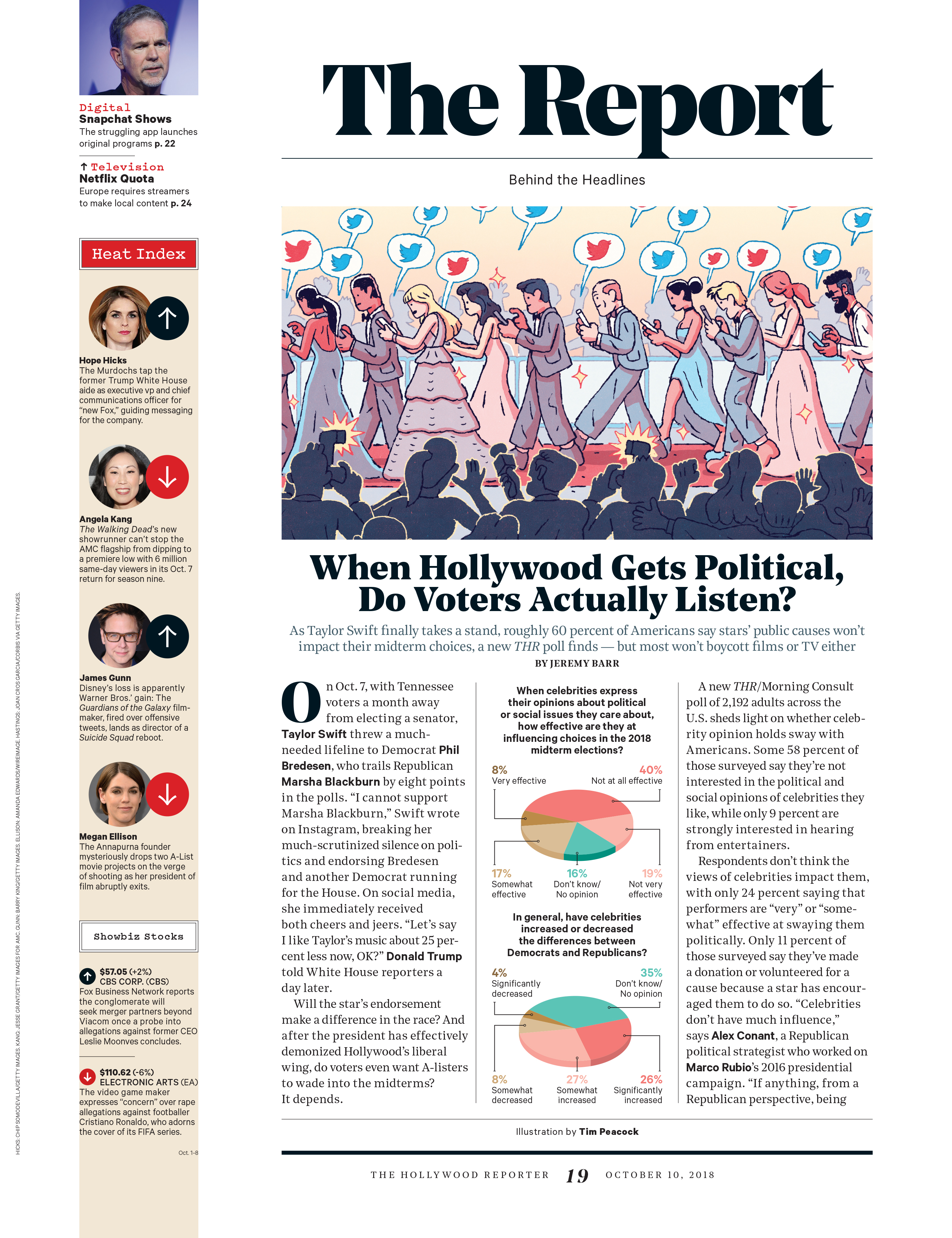
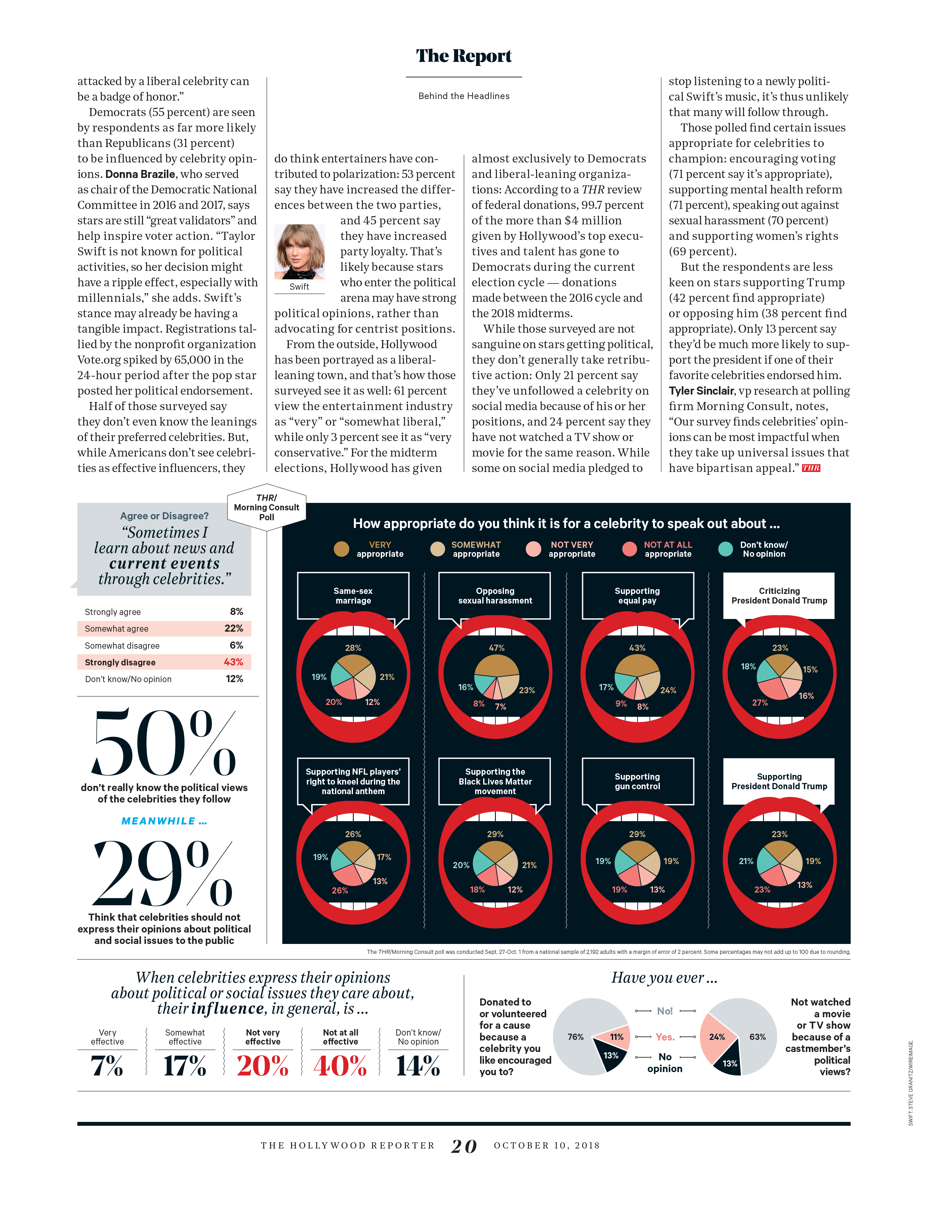
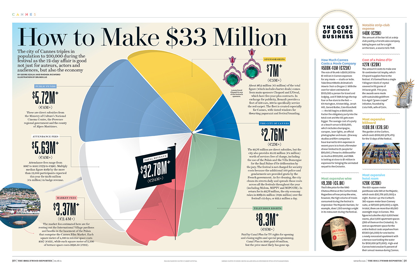
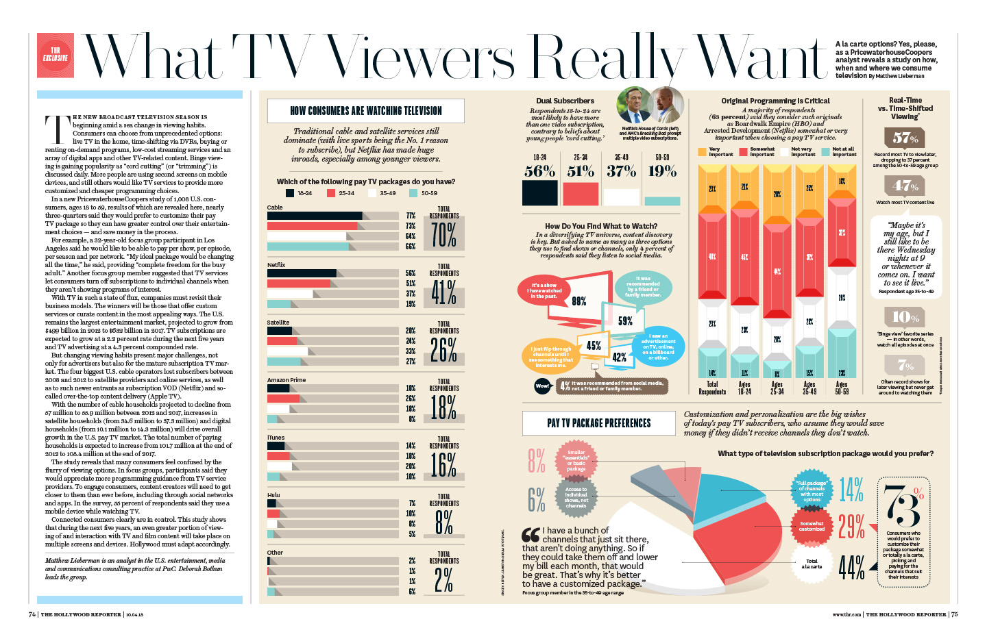
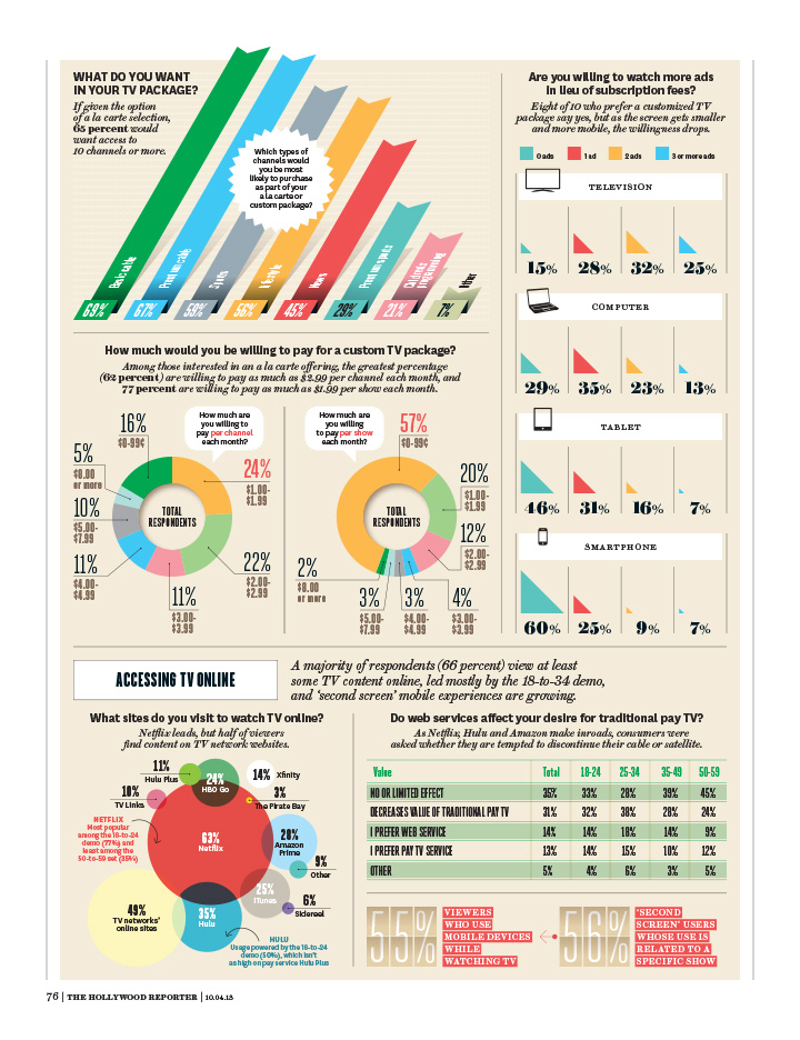
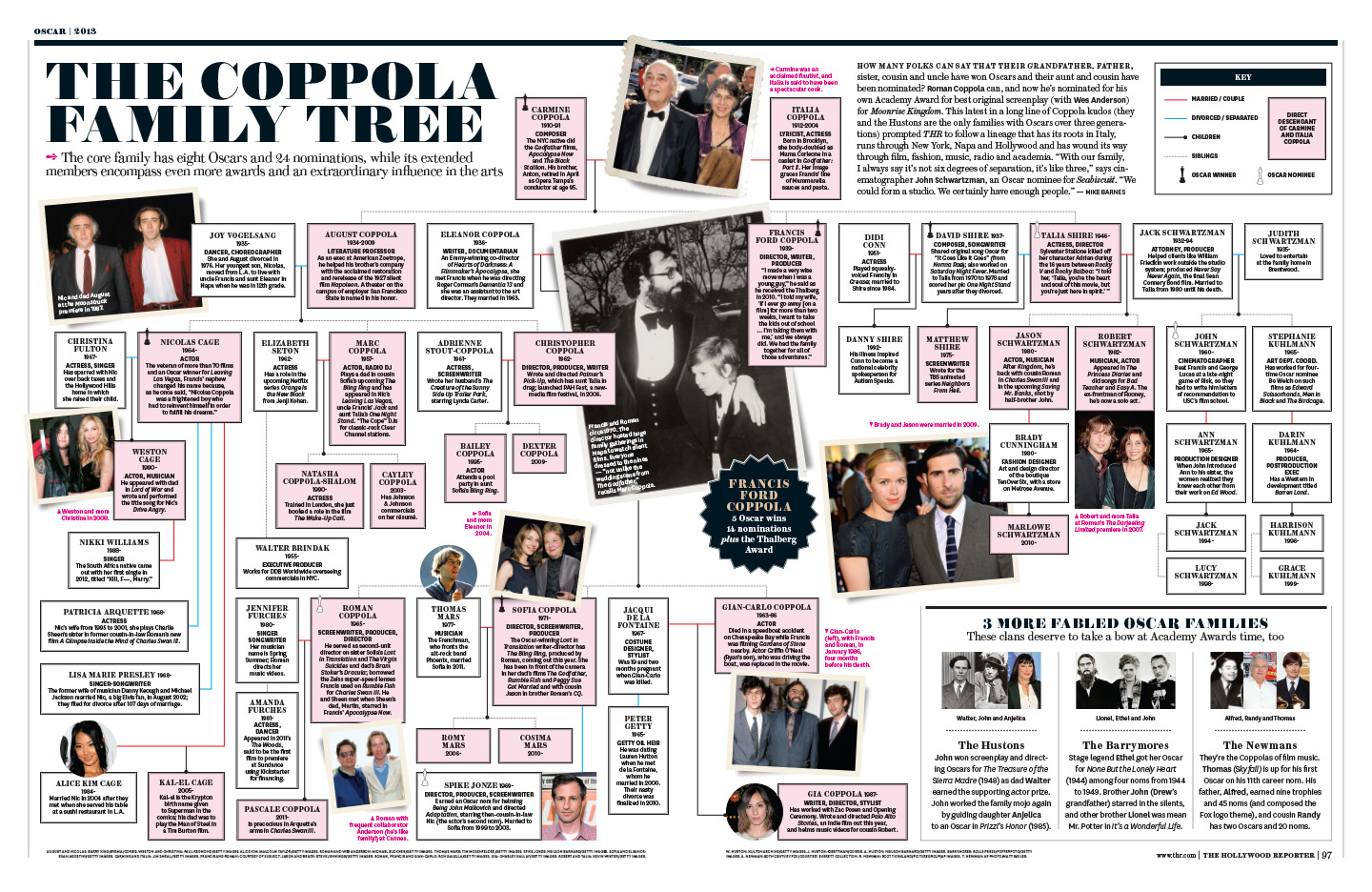
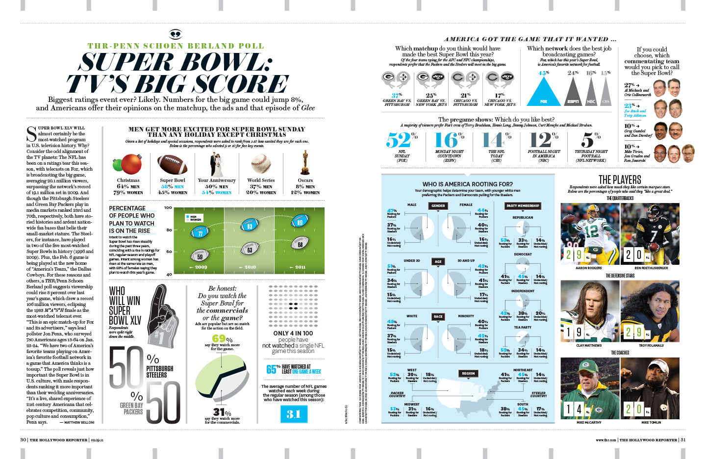
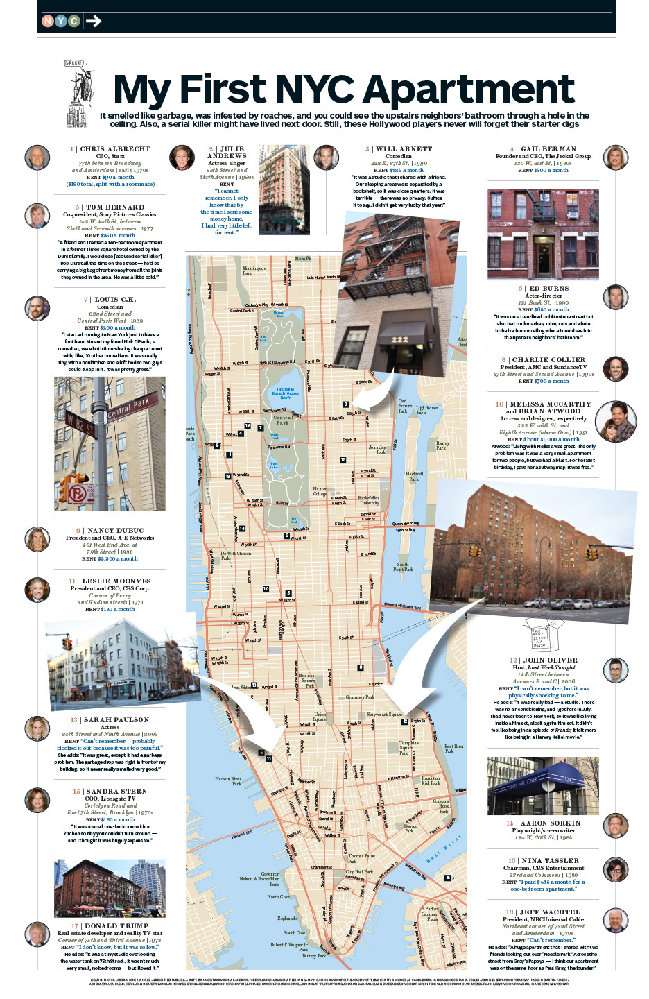
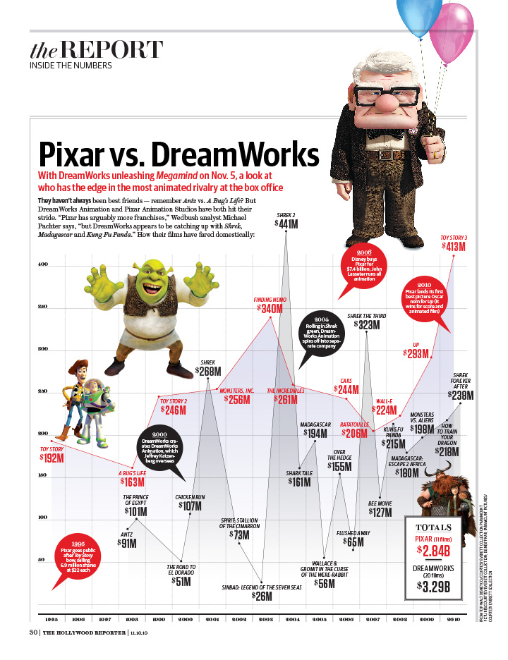
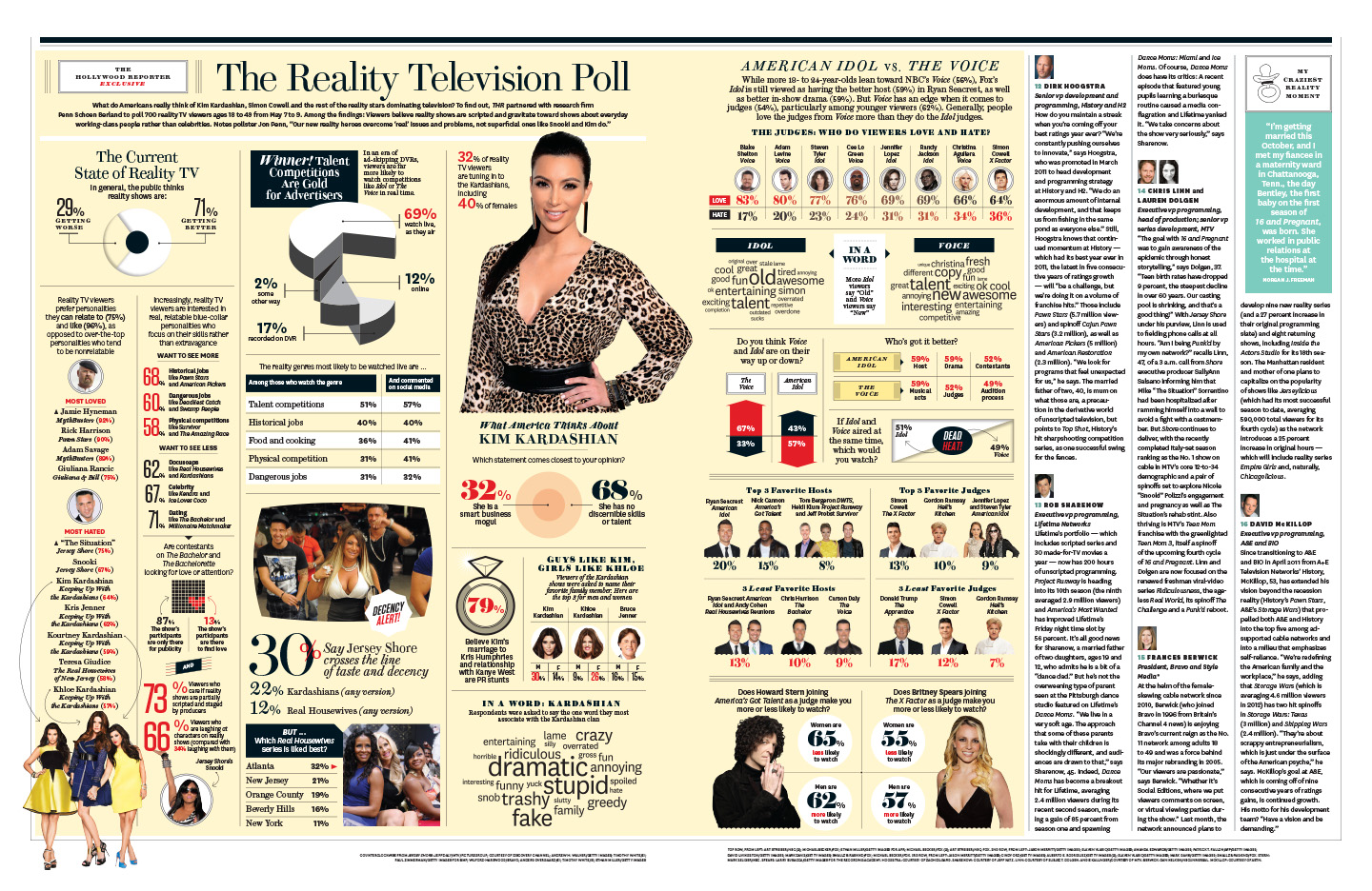
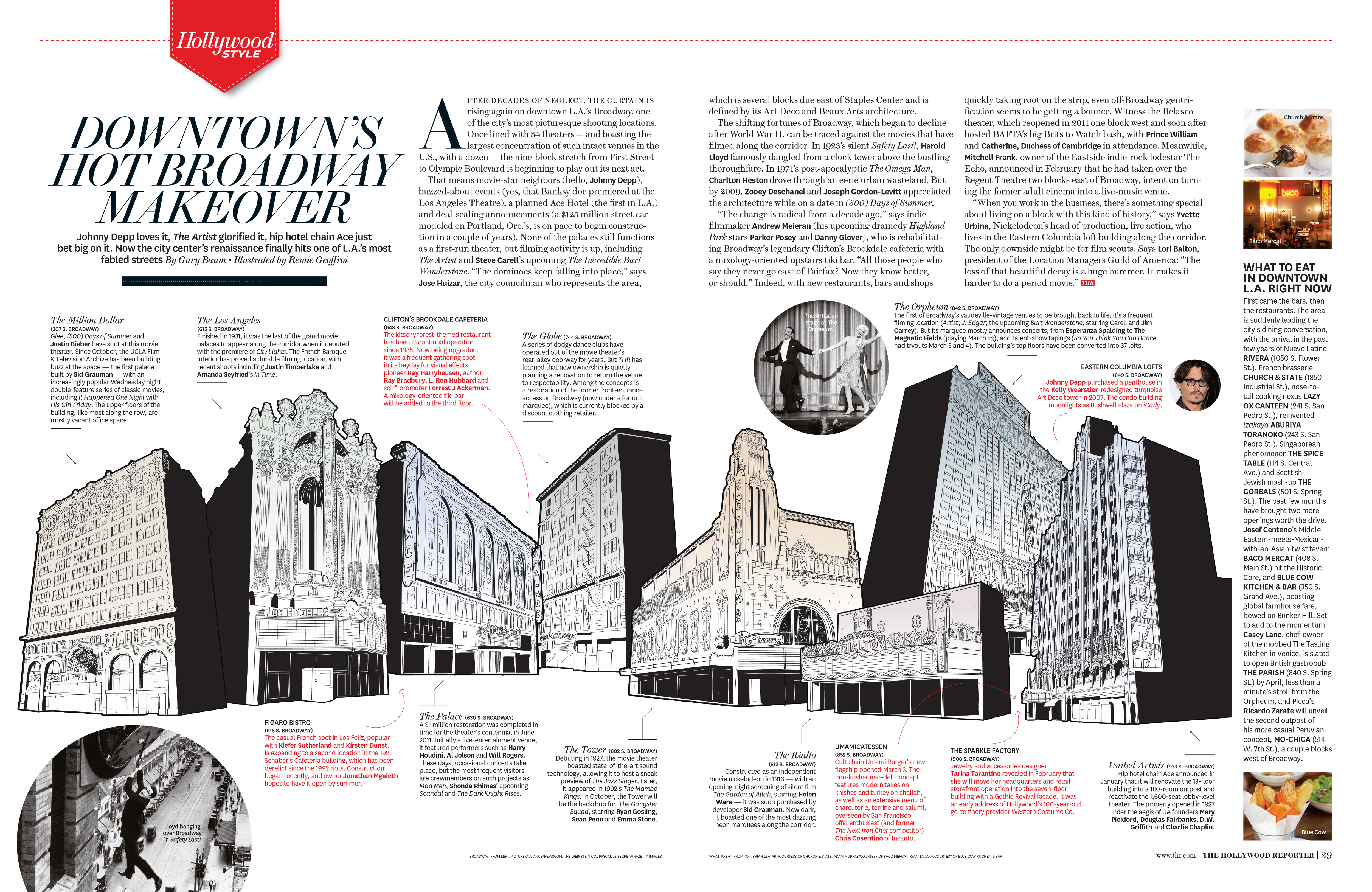
Charts, polls, and maps often begin as dense data, with the goal to make them engaging and easy to understand. I specialize in turning raw numbers into visuals that are not just informative, but also fun, inventive and visually compelling. For me, it’s about finding the story in the data — and designing a way to tell it with clarity and energy. The best results not only explain the information, but they make people want to keep looking.